- Published on
🌍 Accessible Websites Are a Big Deal
Why Accessible Websites Are a Big Deal
There are so many reasons to make websites accessible! Microsoft Inclusive Design champions the idea that the web should reflect human diversity—it’s about embracing all kinds of perspectives. It’s like building a website that speaks everyone's language, and no one gets left out. In their words:
"Inclusive Design is a methodology, born out of digital environments, that enables and draws on the full range of human diversity. Most importantly, this means including and learning from people with a range of perspectives."
When you're building an accessible website, there are four key principles to keep in mind: Perceivable, Operable, Understandable, and Robust (we’ll call them the "Fantastic Four" of web accessibility 🦸♀️🦸♂️).
I’m going to dive deeper into each of these in future posts, where I’ll spill all the tips and tricks I’ve learned. For now, here’s a sneak peek at what’s coming up!
1. Perceivability 👁️
This is about making sure everyone can actually see, hear, or feel the content. Whatever their senses prefer, they can access it.
- 🖹 Text alternatives for images and videos (because, you know, not everyone sees the same way)
- 🎧 Captions and transcripts (for when you don’t want to—or can’t—turn up the volume)
- 🎨 High contrast for readability (think bright white on deep black, not grey on grey!)
- ⛕Adaptable content with proper headings (semantic HTML is your bestie here)
- 📱 Responsive design (so your site looks fab on all devices)
- 🎮 Accessible media controls (pause, play, stop—at your command!)
2. Operability ⌨️
Everyone should be able to interact with your site using whatever tool they like—whether it's a keyboard, a mouse, or assistive tech.
- ⌨️ Keyboard-friendly navigation (because not everyone uses a mouse)
- 🎯 Managing focus (so you don’t lose track of where you are)
- ⏲️ Timing adjustments (no stress from countdowns—hello, extensions!)
- ⚠️ Avoiding interaction traps (modals that don't let you escape? No thanks)
- 🖱️ Mouse alternatives (not everyone can or wants to drag-and-drop)
- 🎥 Control over dynamic content (pause that auto-playing video!)
3. Understandability 🧠
Your website should make sense, period. If it's clear and easy to use, you’re doing it right.
- 📝 Simple, plain language (you’re talking to humans, not robots!)
- 🧭 Consistent structure and navigation (don't make people feel lost)
- 🚫 Clear error messages (instead of "404 error: sad face")
- 🔡 Readable fonts (so users don’t squint at your text)
- 🔄 Logical tab order (because clicking in circles is frustrating)
- ✅ Instructions and feedback (for things like forms and success messages)
4. Robustness 🔧
Your website needs to work today, tomorrow, and with whatever browser or device the future throws at us. 🚀
- 🏗️ Correct HTML (the internet’s building blocks—use ‘em right!)
- 🤖 Compatibility with assistive tech (like screen readers)
- 🛠️ Progressive enhancement (making sure the basics work for everyone)
- 🎧 No auto-playing media (seriously, we all hate that)
- 🧑🤝🧑 Testing with real users, including those with disabilities (because they’ll tell you what works and what doesn’t)
Web design vs Web development
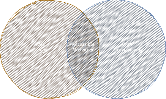
Building accessible websites is all about teamwork between designers and software engineers! Designers whip up eye-catching visuals and user-friendly interactions that cater to everyone, while engineers dive into the code to make sure everything runs smoothly and meets accessibility standards. When these two join forces, they create awesome websites that look great and are super easy for everyone to use, no matter their abilities. It’s like the ultimate tag team for a better web experience!

The takeaway? Making websites accessible isn’t a solo gig. It takes collaboration between design and development to get it right. But since I’m a software engineer, I'll be focusing on the dev side of things in this series. Stay tuned for more on how to make your websites accessible AF—one step at a time! 💪✨